

An infographic is a collection of imagery, charts, and minimal text that gives an easy-to-understand overview of a topic.
The use of infographics is getting common due to tons of available content in the web and social media.
Marketers use infographics to build awareness and boost engagement while educators use infographics to make content more memorable for students.
Different sectors may have different objectives in using infographics, but ultimately the only aim is to grab the attention of the reader or targeted consumer to absorb the information easily and quickly.
Infographics are especially helpful in making complex information easy to digest. They are commonly used for:
- Provide a quick overview of a topic
- Explain a complex process
- Display research findings or survey data
- Summarize a long blog post or report
- Compare and contrast multiple options
- Raise awareness about an issue or cause
When you need to give someone a really quick rundown on something that can be hard to explain in words alone, an infographic is a good way to go.
Watch from 2:00 below to learn the distinctive characteristics of Infographics:
3 Key Considerations before Designing an Infographic

1. Medium
How will your infographic be disseminated? There are 2 types of delivery mediums when disseminating infographics, it’s either through print or digital. Print can be in the form of flyer, booklet, signboard, etc. While the digital can be in the form of your EDM (electronic direct mailer), e-banners, social media post, etc. You need to consider the orientation of each type of medium to be used when designing your infographics.
2. Audience
Who will be receiving this information? Your audience will determine the type of content to be presented in your infographics. You can determine the type of content to be presented using the Elaboration Likelihood Method which is a concept derived from psychology studies on sales and advertising tactics. For low elaboration likelihood audiences, you need to focus on making the message attractive. This type of audiences are less likely to evaluate the content presented, they focused more on the pros and cons of the message, therefore attractive messages works better on them. On the other hand, the high elaboration likelihood audiences tend to be more deliberate when they are going through the content presented. Therefore you have to focus on making the message informative using more statistics and credible sources when presenting your content.
3. Content
What type of information should be included? There are 3 simple questions that you can ask yourself to determine the content structure of your infographics:
- What is the desired outcome of the infographics?
- What information must be included to achieved desired outcome?
- How should the information be presented?
What makes an infographic design effective?
There’s a lot to consider when picking an infographic template, including the colours, fonts, length, size, and style of each template, and how well each of those factors aligns with your content.
If you are doing a statistical infographic which is more focused on numbers, charts and data, emphasized on big numbers will be suitable to grab the attention of the readers.
Informational infographic on the other hand, has a narrative flow and contain more text compared to statistical infographics.
Therefore, it is important to structure our information visually and create patterns that will enhance the message that we’re trying to communicate.
Use lines, borders, and shapes to group related information
Even something as simple as the position and grouping of elements on a page can influence the way our readers understand our graphics.
If we use basic design elements like borders, lines, circles, and squares to visually organize our content, our readers will find it easier to interpret that content.
For example, we can enclose related elements within an outline or a shape. Most infographics, like the one below, use this tactic to break up the design into multiple sections, making the graphic easier to scan.

Use one contrasting colour to guide your readers’ attention
Another major design element to think about is colour. We’re naturally inclined to use colour to make infographics look pretty, but colour can also be used as a powerful communication tool.
Just like lines and borders, colours can be used to indicate information groupings, as seen in the business strategy infographic example below:
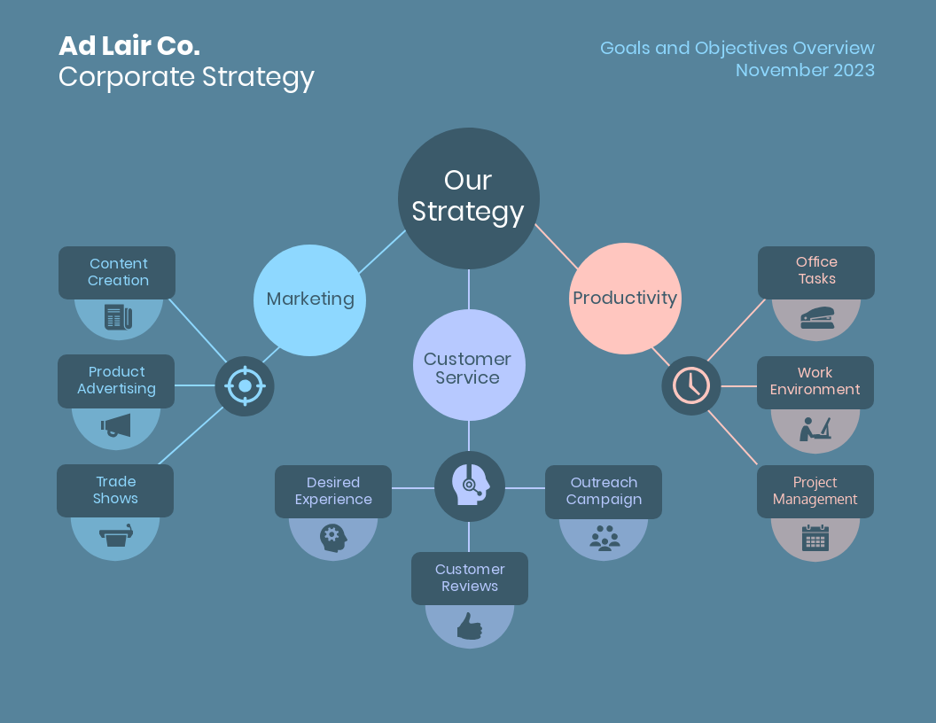
But more importantly, we can use colour to draw attention to particular pieces of information and push supporting information into the background.
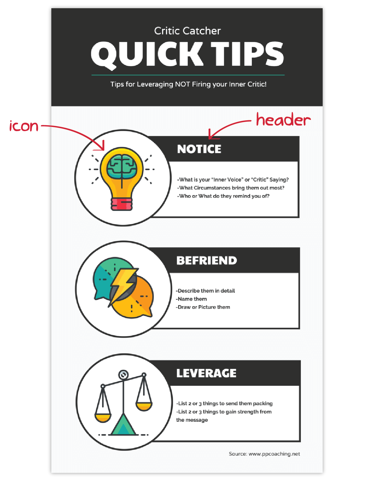
Use images, icons, and illustrations to make key takeaways memorable
Last but certainly not least, make sure that the focus of your infographic is on visuals like images, symbols, icons, illustrations, and charts.
Visuals are crucial for making your information engaging and memorable. The best infographics have an equal balance of text and visuals.
The easiest way to make sure you have enough visuals in your graphic is to add an icon to represent each header, as seen in the example below:
It’s important to have fun with your design, too. It doesn’t need to be strictly business-y and serious. Infographics are supposed to be engaging and memorable, and illustrations are great story-telling devices.
If you’re feeling really ambitious, you can even create a feature visualization like the one below that represents all of your information visually, eliminating the need for almost all of the text.
Conclusion
The best infographics use a combination of text, images, and data to inform and engage.
If you’re ready to create infographics that strike the perfect balance between fun and educational, make sure you follow these infographic design best practices:
- Use lines, borders, and shapes to group related information.
- Use one contrasting colour to draw attention to key information.
- Use images, icons, and illustrations to make key takeaways memorable.
Learn how to create your first infographic using Microsoft PowerPoint with us!
Get in touch with us at (65) 6720 3333 or training.aventis@gmail.com for enquiries.
Article Source: